Rashida Kamal

Enigma - Reports & Blogs
Throughout my time at Enigma Technologies, I wrote a number of blog posts that explored a particular public dataset to show what was available in Enigma Public. I primarily used python-based data tools(pandas + matplotlib) to create the basic structure of a chart, and then finished the design in Adobe Illustrator. For maps, I used a combined workflow of QGIS to Illustator. I also used a command-line tool called ImageMagick to produce of the gifs. Below is a selection of charts and graphics I made in this capacity, along with links to the original posts.
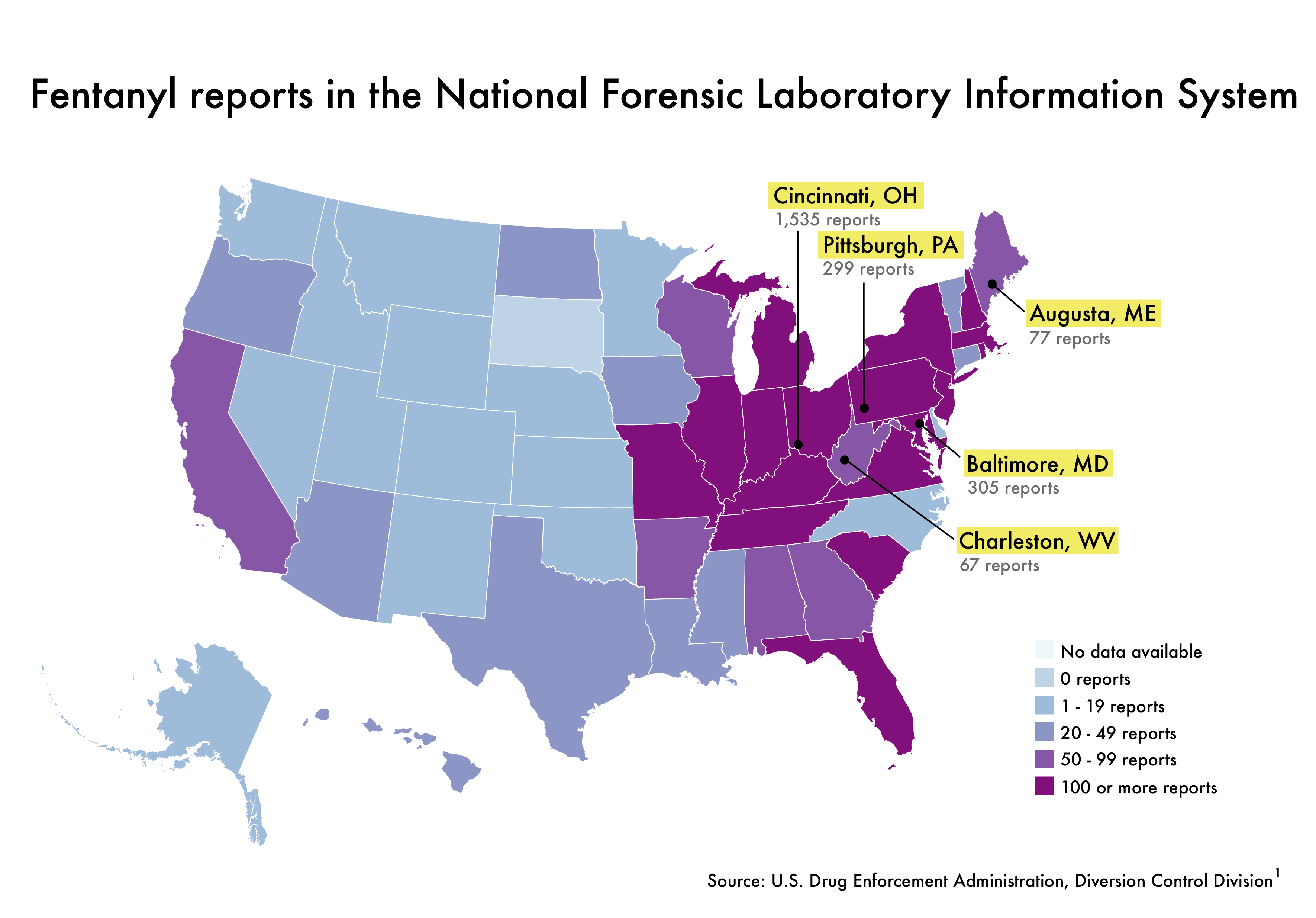
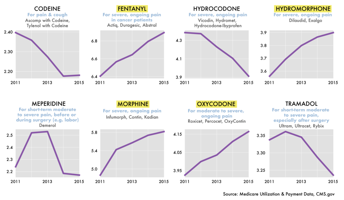
Mapping Fentanyl and the Data Gaps in the Opioids Crisis
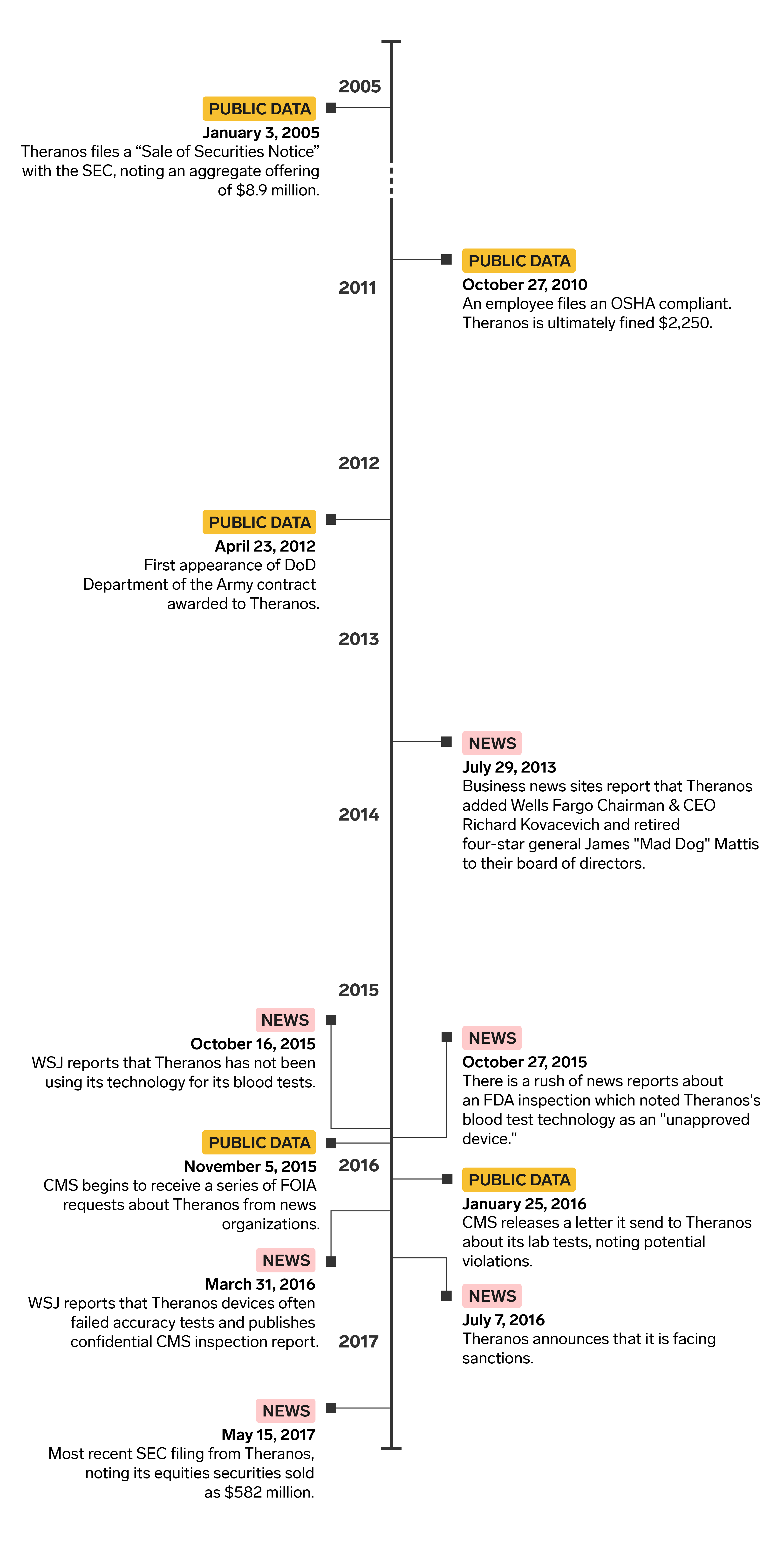
Theranos: Tracking a Startup in Trouble Through Public Data
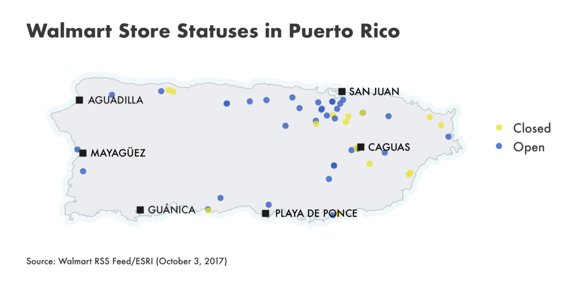
Puerto Rico Post-Maria: Peering into Catastrophe through a Corporate RSS Feed
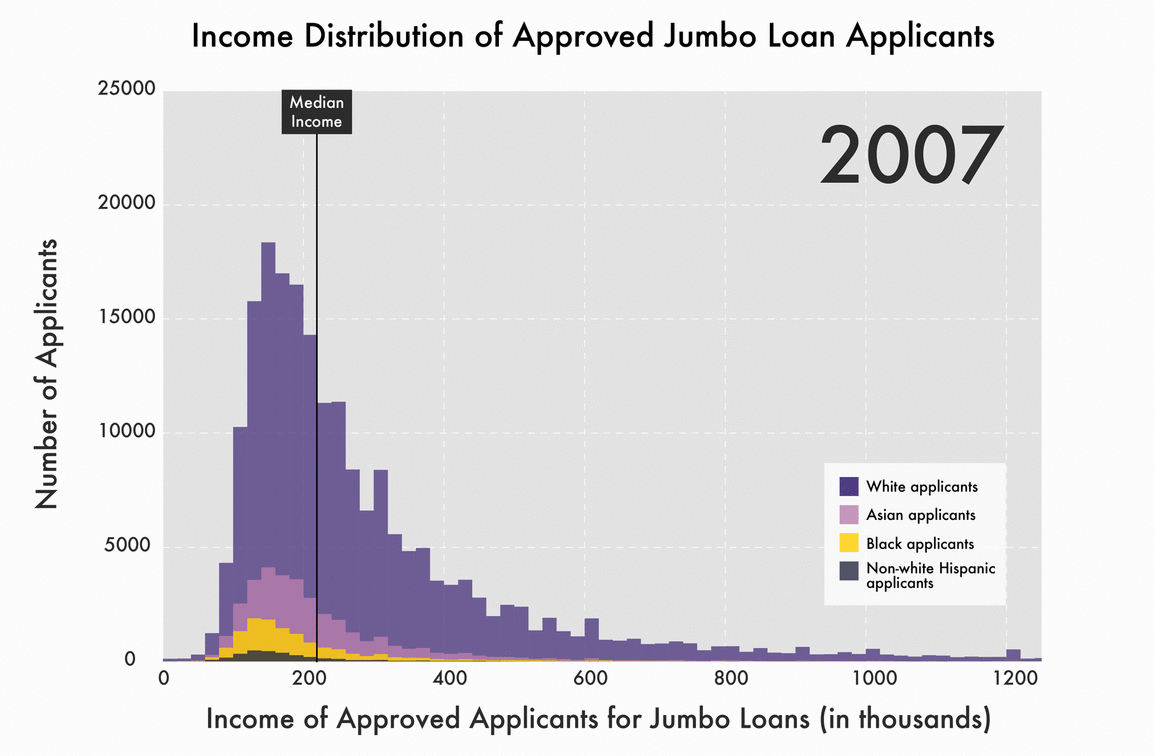
A New Lending Strategy: Mortgages That Are Too Big to Fail
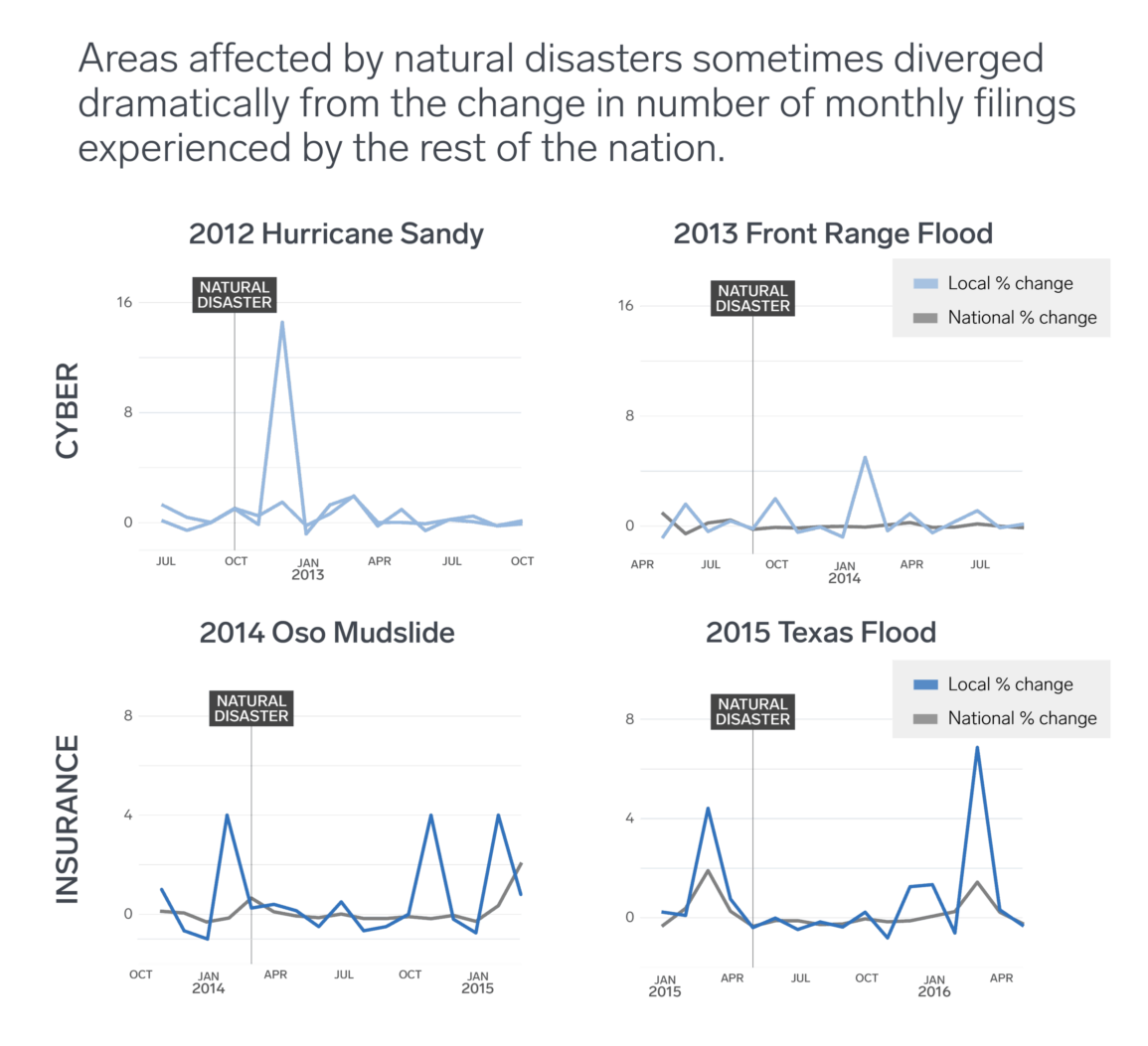
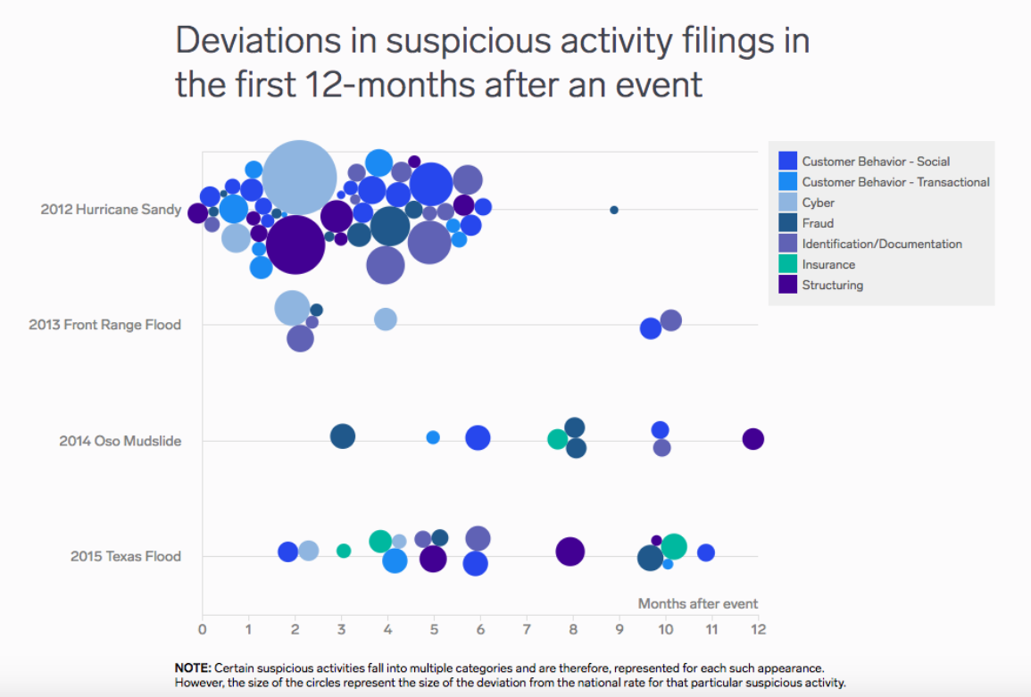
How Public Data Drives Proactive Prevention of Financial Crimes in the Wake of Disaster
Interactive version here.
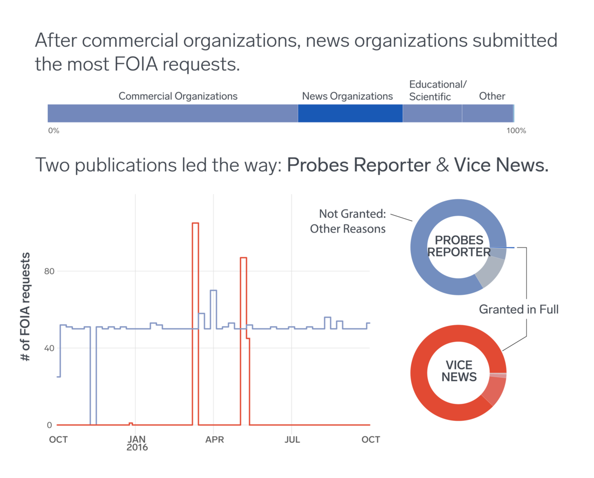
Look at the Logs! (FOIA Edition)
I also completed a number of other posts that were informed by data and related documents, but did not necessarily have a significant visual component:
- Enigma: When Consumers Complain, Who is Held Accountable?
- Enigma: What Happens to Accountability When Data Goes Dark?
- Enigma: Public Data and the Challenges of Moving from Information to Insight
- Enigma: Product Safety: Pants and Fidget Spinners on Fire
- Enigma: Meaningful Governance in the Age of Permanent Crisis
- Enigma: A Game of Memory: Patents Edition
- Enigma: Trend Watching Across FinCEN’s Suspicious Activity Data
- Enigma: Uncovering Intel in FinCEN Suspicious Activity Data