
For this assignment, we were tasked with experimenting within two different programs at various parts of our data pipeline. Results below:
Part 1: Experiments with Grafana
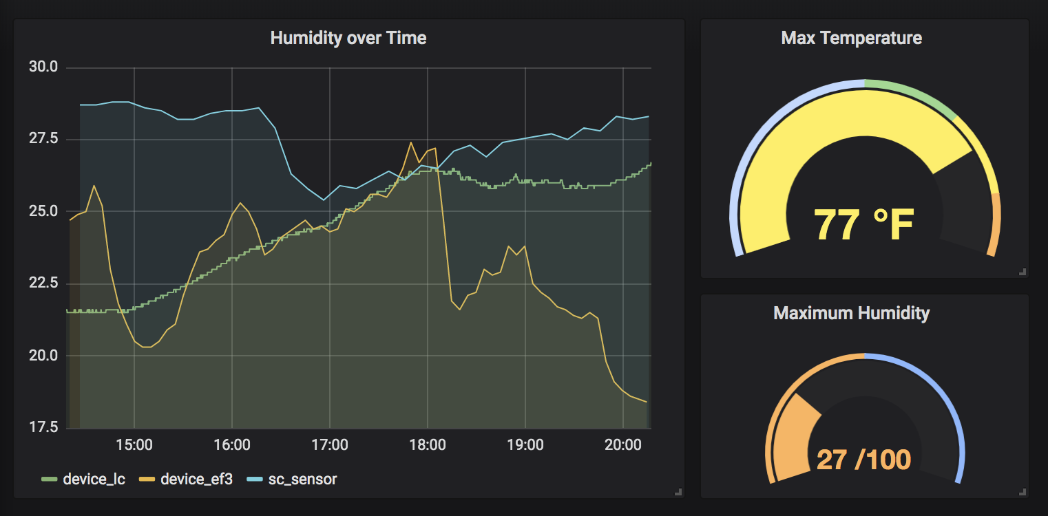
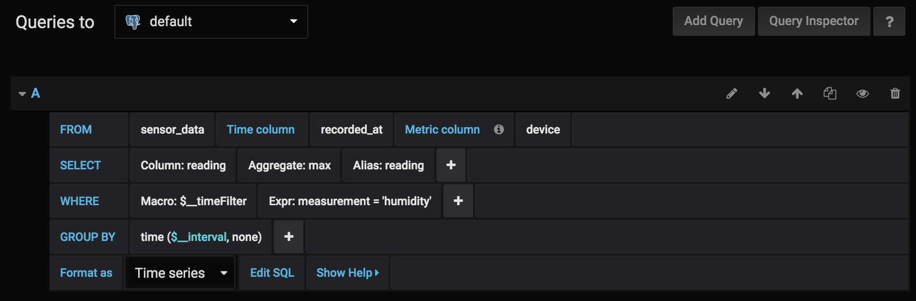
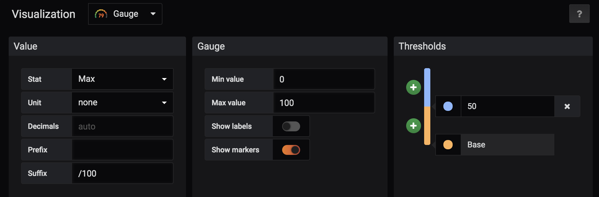
I came up with the following dashboard, focusing primarily on looking at humidity data over time, with relevant max values represented as well:
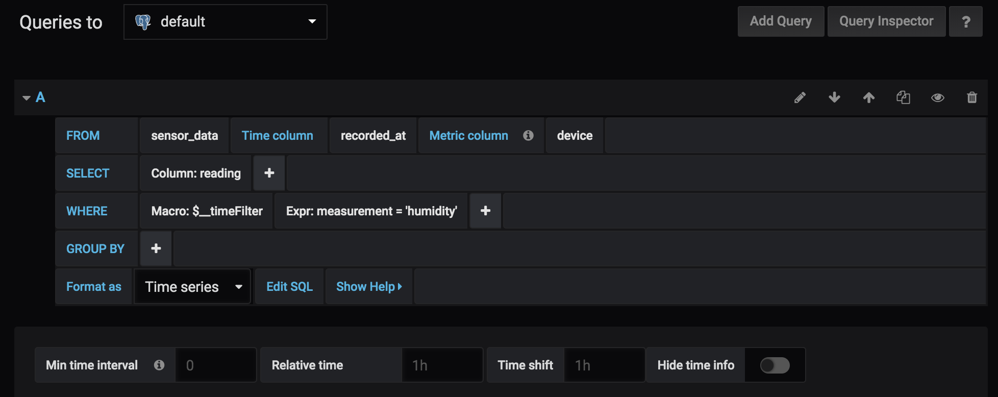
I used the following query for line chart:
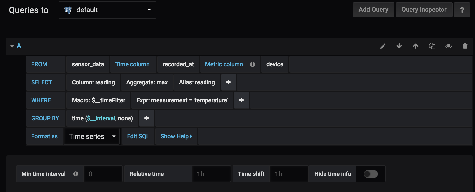
For the temperature guage, I used the following query and settings:
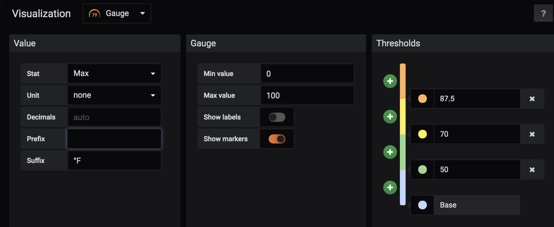
For the humidity guage, I used the following query and settings:
Part 2: Experiments with Node Red
I made some adjustments to the workflow we did in class to make it so I recieved an alert whenever the humidity of one of our sensors went above a measurement of 20.
The workflow can be seen below:
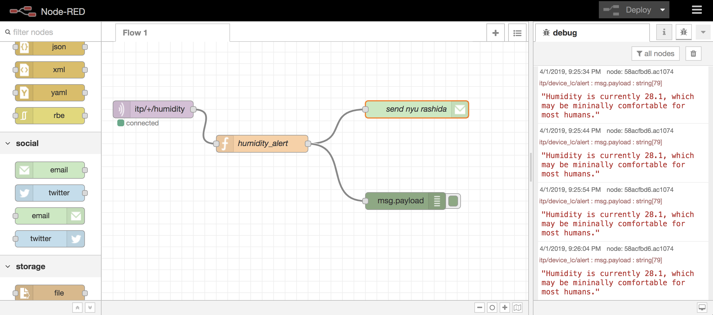
I sent the alert to my NYU email, rather than my personal gmail.
Here’s a link to my workflow gist: https://gist.github.com/rashidakamal/5d830a73e96a584e857831d93c6bc685